Why Contrast Can Make an App Icon Feel Bigger
Perceived icon size follows contrast and silhouette more than literal pixel footprint - useful when refining something like Tinker at dock and launcher sizes.
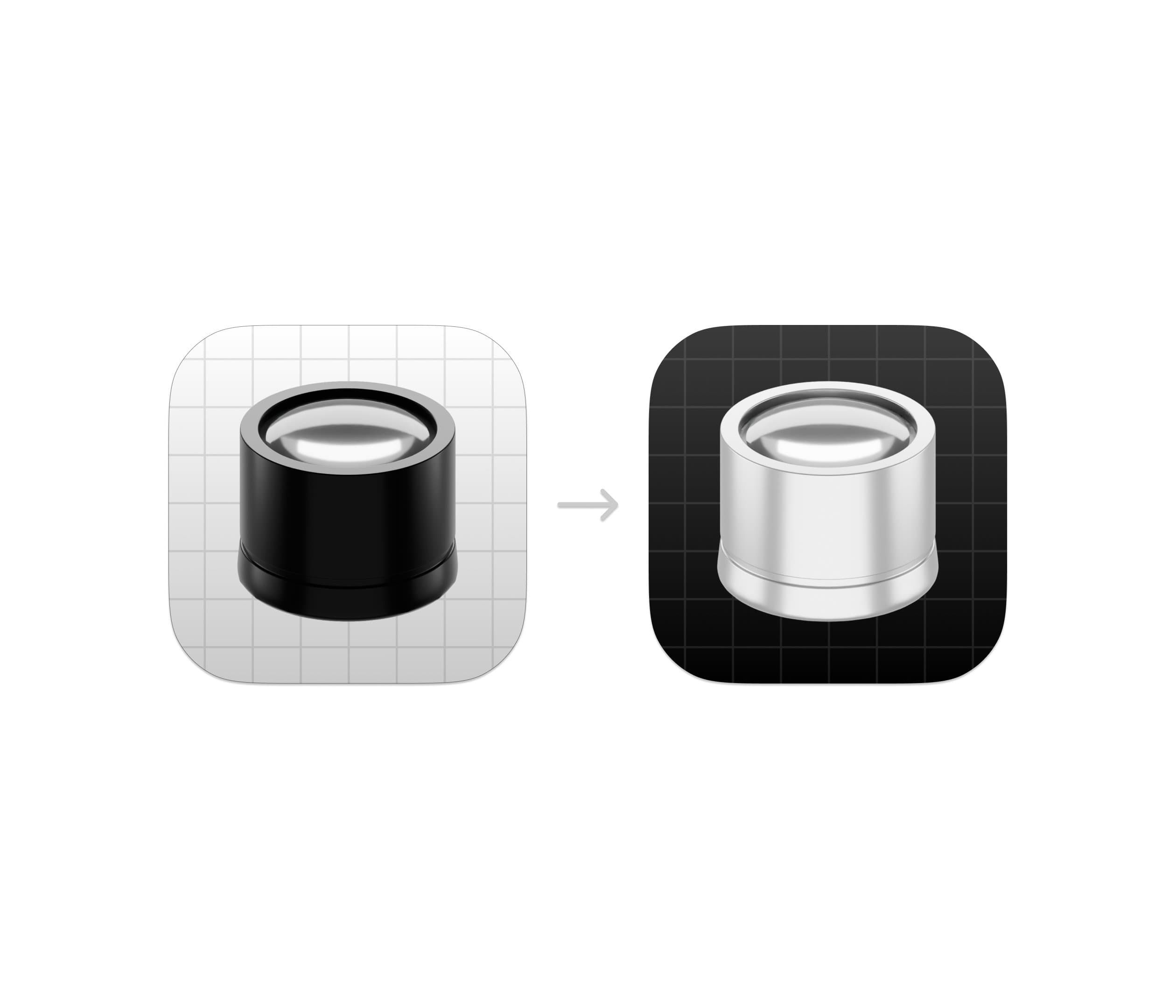
One of the more interesting things about icon design is that perceived size and actual size are not the same thing.
An object can occupy the exact same number of pixels inside an app icon and still appear significantly larger or smaller depending on how visual information is distributed around it.
While refining the upcoming version of Tinker, I revisited something I intentionally use quite often in icon work: adjusting contrast to manipulate perceived scale.
The render itself did not become larger. Its perceived visual weight did.
This effect is closely tied to how the human visual system prioritizes edges, luminance contrast, and dominant shapes during rapid recognition.
At small sizes, the eye is not analyzing detail in the way we often imagine. Instead, it relies heavily on: • Contrast boundaries • Shape recognition • Brightness grouping • Edge clarity • Separation from background elements
This is partially explained by principles from Gestalt psychology, particularly figure-ground perception. High contrast separation helps the brain identify an object as the dominant “figure” more quickly, which can increase its perceived prominence and apparent scale.
In practical terms: a subject with stronger contrast definition often feels larger than a physically larger subject with weaker separation.
Interestingly, adding more detail often reduces perceived size. Fine texture and micro-detail distribute visual attention across smaller regions, which can make the primary form feel visually compressed.
This is one reason many highly effective app icons appear surprisingly simple when reduced to their essential structure. They are optimized for rapid visual parsing rather than realism.
A few variables that strongly influence perceived icon size: • foreground/background luminance contrast • edge sharpness • shadow density • local contrast concentration • negative space • silhouette simplicity • visual mass distribution
One useful way to think about it is this: The eye reads contrast energy before it reads detail.
That means a carefully controlled contrast hierarchy can increase perceived presence without increasing actual scale.
When designing icons, this is often preferable to simply enlarging the render itself. Increasing scale too aggressively can reduce breathing room, weaken composition, and create visual tension inside the canvas.
Adjusting perceived weight instead tends to preserve balance while still improving readability.
And at icon sizes like 16px or 32px, those perceptual differences matter far more than most people realize.
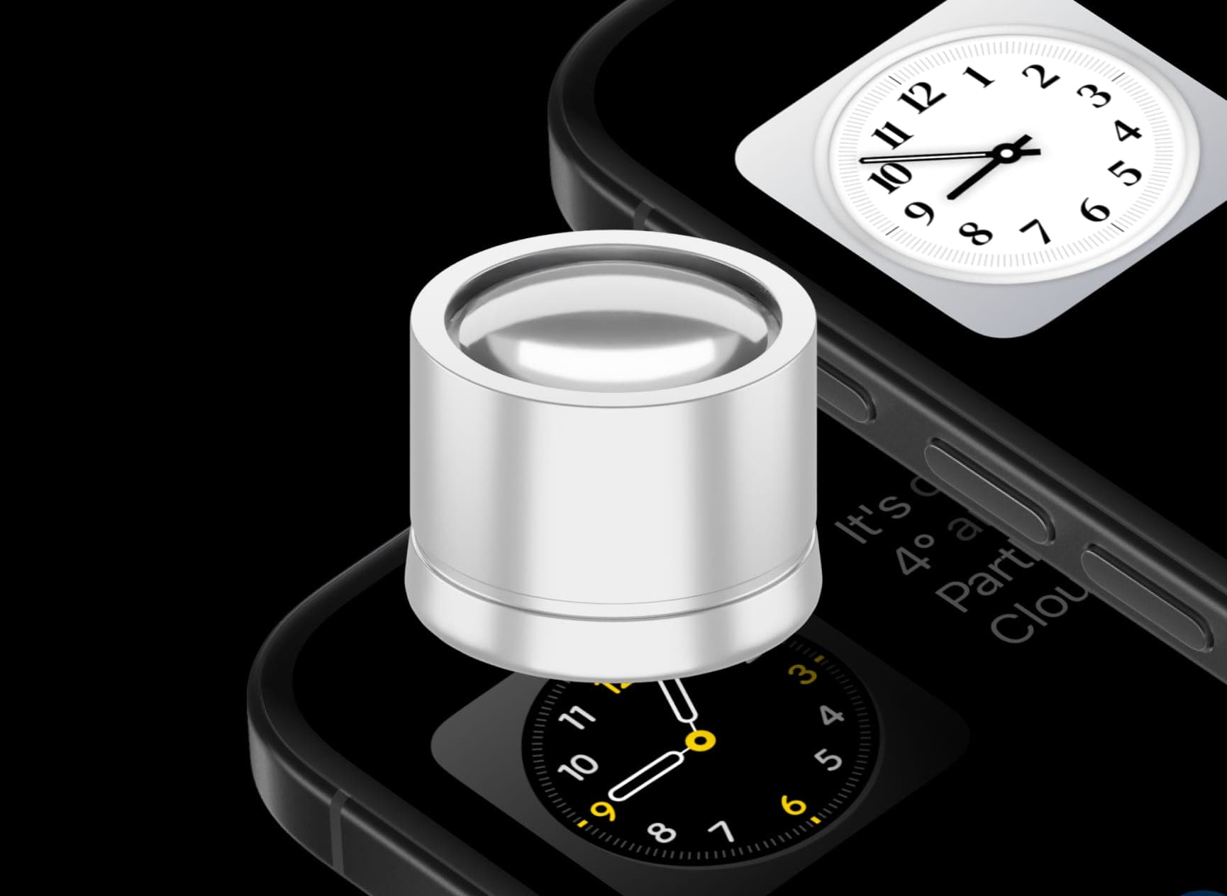
Tinker is available on the App Store:
