Recreating Old-School Mac Icons in Blender
Why lighting matters more than anything else.
There's something oddly magical about old-school Mac icons. They weren't fully realistic, and they weren't minimal either. They lived somewhere in between. Soft, tactile, glossy, tiny objects sitting at the bottom of your screen.
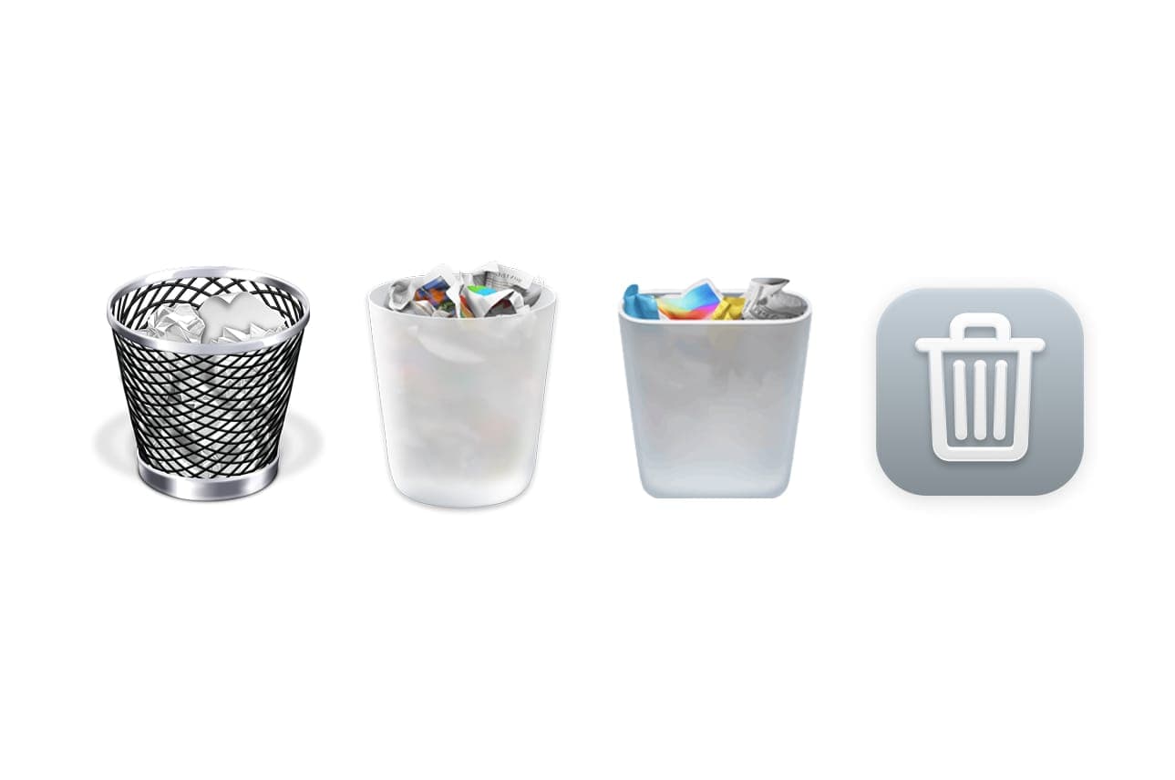
I've been obsessed with that look for years. Back in the skeuomorphic days, icons felt like real things. A trash can looked like an actual bin. Notes looked like paper. Buttons had depth, shine, personality. Everything felt intentional. Playful.
If you look at the macOS trash icon, you can almost see the entire shift in design. It started as a rendered shiny wireframe mesh, then became a rounded plastic object, then a flatter plastic version… and now you kind of wonder what's next. Just a completely flat icon?
And sure, flat design has its place. But everyone is going to be creating these kinds of icons, and we're going to see a lot more of them. It's easy to make, easy to scale, and at this point almost anyone can put together something clean and flat. That accessibility is great, but it also makes a lot of it feel interchangeable. Safe. A little boring.
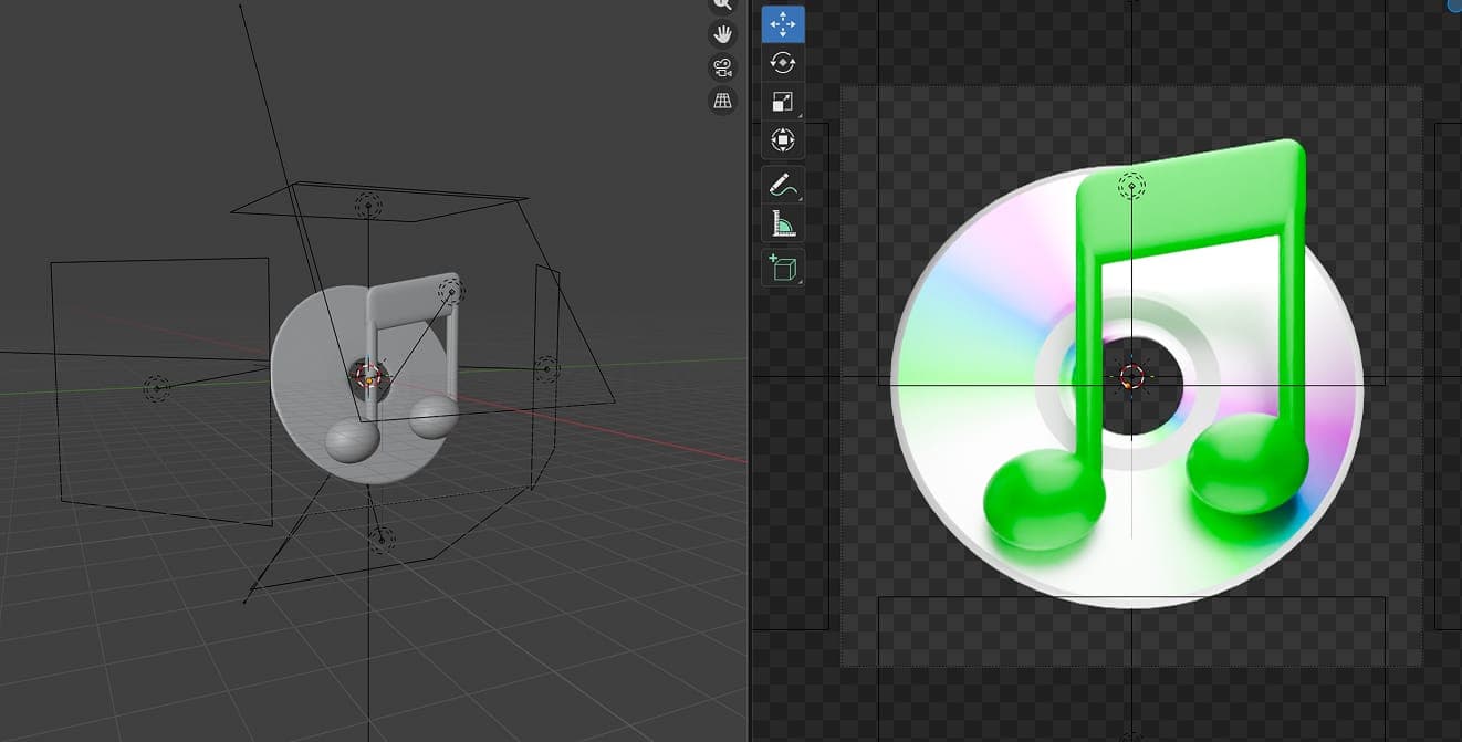
That's why I keep coming back to this older style. Instead of just admiring it, I started recreating that feeling in Blender.
What surprised me is how little modeling actually matters. Most of these icons are just simple shapes with soft bevels and slightly exaggerated proportions. The real difference is lighting.
Lighting is everything. Those old icons weren't lit realistically, they were lit intentionally. Highlights and shadows were placed to make the shape read instantly, like a tiny object in a perfect studio. Once that clicks, the whole thing works.
Using Blender's Eevee renderer helps a lot here. It naturally gives things a softer, slightly stylized look. Less realistic, more icon-like. That subtle shift makes a big difference.
And the best part is how easy it is to experiment. Move a light, tweak a material, adjust a curve. Small changes completely transform the result. It turns something that used to feel mysterious into something you can actually play with.
In the end, it's not about complexity. It's about intention. That's what made those icons special. And that's what I'm trying to bring back.
